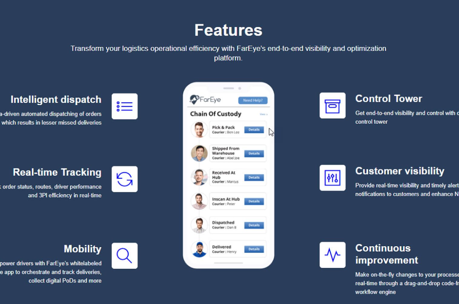
Essential UI Elements for Design: Business Warehouse Management App
Business intelligence software is designed apps which can record, analyze and report from big data. For instance, corporations or small businesses imply business intelligence technologies into their operations progress by using data warehouses, dashboards, data discovery tools, and cloud data services. In this section, we would consider the significance of the business warehouse app as business intelligence software.
The warehouse management app plays a significant role in improving the distribution center productivity which would take plenty of time in training the end-users. In order to get efficient human resources, a manager should provide a training process through days or weeks. If half of the employees quit the job after getting the whole training process, it is not only time wasted but also related to suffering cost in training. As such, the warehouse management app is essential for a business to simplify the processes so that it can reduce training time which results in cost-saving increase productivity.
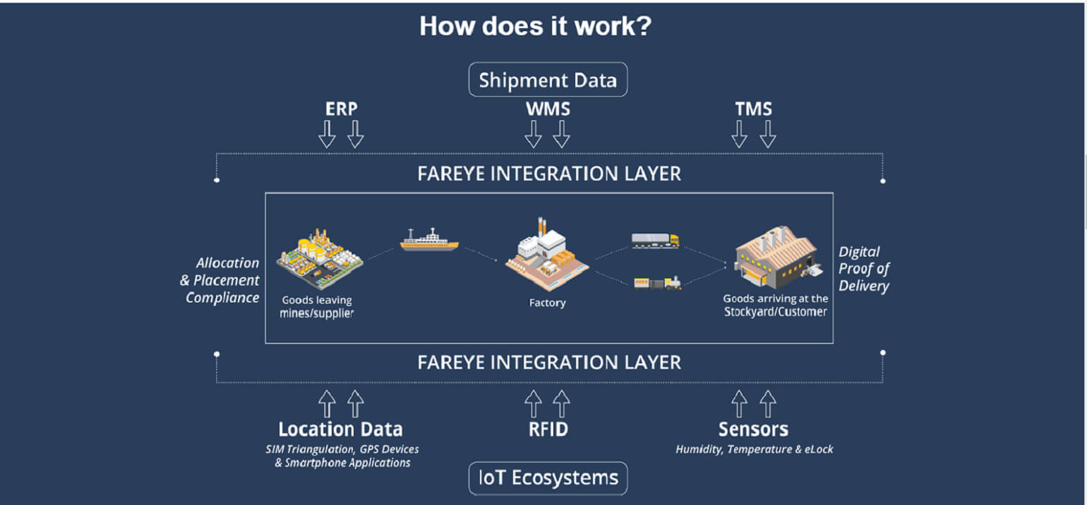
Warehouse app’s target users are shop owners and staff, so a clear and obvious design is supposed to be made. Minimizing ambiguity would limit the chances to make mistakes and get lost in the app. At this point, you probably raise the question “How can you build in the elegant warehouse management app?” The following sections would help you to have a detailed understanding of UI elements for the business warehouse app and how you can simply design an efficient app with good user interfaces.
What Are the Essential User Interface Elements?
What is UI?
UI stands for User interfaces which can be easily understood as a communication point between humans and a computer or machines to accomplish tasks. UI elements are the kits for establishing or building up a software, app or website.
Why a good UI design is a significant factor for intelligence business?
Here are 5 unarguable reasons to explain the question above:
Reason #1: It’s about how you present your offering matters the most
A poor or complex interface design application can drive the approaching traffic away and leave a terrible taste. This is the essential motivation behind why such a large number of organizations put their assets in finding an intelligent UI design and development firm that can bring inventive interfaces.
Reason #2: Better design for better business
How well the app communicates visually with the user based on the graphical design such as branding, color scheme, layout, graphics, tab and button placement, typography usage, white space and so on.
Reason #3: Right content- best-required marketing tool
It’s implied that effective communication is fundamental significance with regards to focusing on the clients’ needs — and stable UI makes sure that your display in a delightful platter that announces to individuals it is proposed to satisfy.
Reason #4: Finding the right thing at the right place is important
Consistent navigation that is similarly simple to find and peruse through is the essential need that an application’s UI must take into account. In the event that the navigation is complicated for a client to work with (or far and away more terrible, hidden someplace, its absolutely impossible they will need to spend more time in the application or return later. Modern and developed business, digital marketers and UI-UX designers put in a great deal of thought into the perfect navigation dependent on business type, products or services.
Reason #5: Form and functionality are decisive factors
At last, it is all useless if the application’s usefulness isn’t up to speed. This is the reason why usability parts of a mobile app are necessary for its short-term and long-term success. Functionality is the establishment of a good UI and can go far in guaranteeing an excellent client experience.
How to name UI component
There are several elements to be considered when designing an app such as touchpoints, checkboxes, sliders, notifications and so on. In order to simplify identification and easier for designers, these elements are grouped into 4 components which are input control, navigation components, informational components, and containers.
- Input control: users transform their information through these elements in this component which means if you want users to input information to the system, input control would be used to let them do so. The component consists of checkboxes, radio buttons, dropdown lists, list boxes, buttons, toggles, text fields, date field.
- Navigation components are viewed as a guide to lead users to move through an app so it should be designed as simple as possible. The component consists of breadcrumb, slider, search field, pagination, slider, tags, icons, etc.
- Informational components allow users to get information shared in the app. It includes tooltips, icons, progress bar, notifications, message boxes, modal windows.
- Containers contain or hold related information. One element in this category is accordion.
5 essential small UI elements with interactive impact on your design
There are various UI elements listed but here just some of them are covered in detail in this article because it is commonly found in the vast majority of layouts. We are going to discuss its functions and role in the following section.
#1. Button
The button is one of the commonly found elements in any app or website interfaces. It presents the action in touch with a typical label such as touch, icon or both. In other words, users can take a particular action on buttons such as submitting. Through a button, the machine can interact with users by understanding what actions the user wants to do next then later turn into graphical user interfaces. Also, users can send their command to the system directly such as download an app, add text, send an email, sign-in and so on. Therefore, the button is considered a user-friendly interface. There are 4 types of button: hamburger button, ghost button, expandable button, plus button. As a designer, it is important to considered how to design a consistent button with the general artistic concept but outstanding enough in the layout for an effective button.
#2. Bar
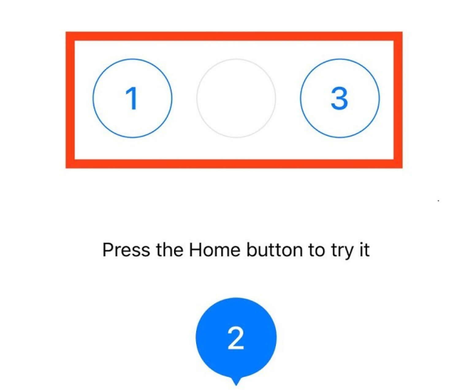
The bar is where users can click into and quickly interact with products through some steps. Also, users can be informed about the current stage of a process. There are 3 different kinds of bar: Tab bar, Progress bar, and Loading bar.
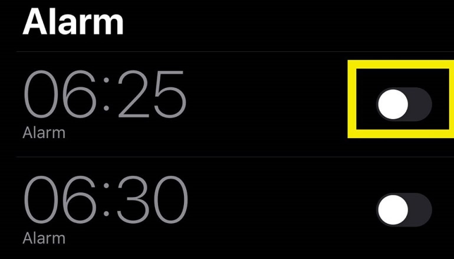
#3. Switch
The switch is a control that empowers clients to turn on/off. Like a button, it is connected proficiently done interfaces. Just as a button, it is applied proficiently in current interfaces as it exhibits the immediate impersonation of switches individuals are acclimated within real life. The essential purpose is that the switch should have a state which ought to be made visibly clear and notable thus the client might undoubtedly see if the option is active or not. Features as contrast and slight animation might settle on the background for an effective and user-friendly UI element.
#4. Picker
As it’s obvious from its name, picker takes into consideration picking the point from the column of choices. Usually, it is displayed in a scrollable list with a different value for users to pick and set the needed value. For instance, date and time estimations, monetary forms and so on. It’s one of the essential elements because it’s generally utilized in the interfaces which have the usefulness of setting time and dates.
#5. Checkboxes
Last but not least, checkbox also is an important UI element in UI design. It is a graphical UI component allowing users to check or uncheck, as a rule setting the decision for the paired alternatives. Checkboxes and switches can be found in UIs, particularly in the user areas, screen or page settings. Additionally, checkboxes present the usefulness of undertaking directors, plan for the day, time trackers and such.
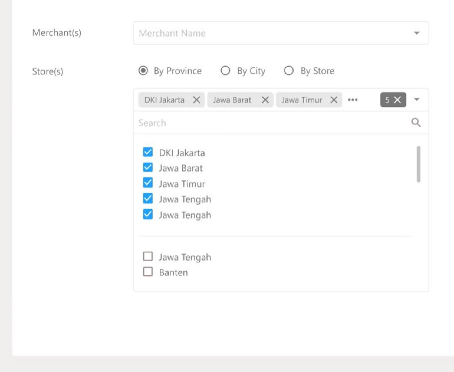
Key Point and Essential UI Elements to Design Effective Warehouse Management App
Custom mobile apps are powerful instruments for improving the Warehouse and Inventory Management process. Though, a strong application with the best-of highlights can be executed inefficiently if the item itself isn’t usable. The main key thing to send out an effective business warehouse management app is to make a user-centric experience that truly helps workers in improving productivity and execution.
What does it mean for the term “user-centric”?
As its name has shown, user-centric is to play your users as the center of your design which means it’s crucial to focus on your target users which are workers for warehouse app. In other words, designers are required to understand users, tasks due, the working environment surrounding the application. Poor ease of use can prompt user disappointment and thus, lessen large efficiency. User-centric design is needed when talking about warehouse and inventory management applications – all things considered, these are the instruments prepared for laborers to play out their activity successfully every day.
Essential UI design tips for warehouse app
Tip #1: Understand your users
It is no doubt that workers know all through’s their daily work better than any other individual. They can regularly disclose brilliant pieces of data to help improve application flows just as user-experiences. Regardless of whether you monitor employees or direct meets, the key is to uncover needs and difficulties in daily work. Getting to a certain degree of sympathy requires more than a cautious examination of details. It means that not only asking their thinking about the design but also about their goal, approaches to achieve the goal and how the app supports them in working through difficulties and challenges.
This data will give you the best understanding concerning how to structure a powerful warehouse app that is simple and really improves daily task execution. Below are some examples of feedbacks provided by workers and recommendations by Shockoe, a mobile app design company, for establishing warehouse app interfaces.
- Item walkthroughs with laborers uncovered a requirement for clear, basic, and instinctive user flows. Therefore, a minimal screen plan, and clear called-to-action on-screen to decrease interruptions.
- The small interface and visual components on the past scanners made it hard to communicate with the gadget so just go large. An approach for this is that they actualized bigger screens and from a planning point of view included huge content and bolder visual components
- Employees are stuck to the juggle boxes and package while trying to communicate with little format scanners. CTA’s designed with large format currently make it simpler to connect with the screen, even with occupied hands.
Tip #2: Understand the warehouse surrounding environment
Where a warehouse app is utilized can significantly impact whether a design is successful or not. Some notable influence factors included in this working environment are lighting, common distractions like noise, clutter, fatigue, and modern equipment. Warehouse conditions produce some obstacles; fork-lifts, conveyor belts, unlimited rows of supply, and those difficulties should all be recorded and considered in the user-experience. Below are some common issues happen in the warehouse and what needs to be applied to your UI design in order to improve productivity.
- Various environmental interruptions (noise, clamoring workers, chatter) and setting the tablet down made it easy to miss a significant notification. As a result, we should make notification enormous, bold, and sticky (ensure they remain on screen until disappeared).
Tip #3: Flexibility and continuous updating
This is a piece of a procedure that is regularly dismissed. Organizations are always developing, changing, and improving; the instruments set up ought to do likewise. Indeed, even an extraordinary app ought to be tried with users and interactively improved over time. In addition, they should flexibly design — sometimes the best ideas don’t function well to reality, so having the option to turn to other alternatives is important to the application’s general achievement. Here are a couple of aspects needed to change to guarantee its continuous achievement:
- Application testing showed manual-workarounds being performed by workers to relabel already picked inventory. As such, one of the ways to solve this problem was to give workers a custom print choice to make labels that would reflect legitimate amounts and date codes all from inside the application.
- The firm’s employees asked for various features for various roles. Due to this reason, responsive user experience is incorporated to move the interface to match the activity function of the present users.
Conclusion
To sum up, this paper provides to audience comprehensive and valuable information about essential UI elements for the business warehouse app which include a definition of UI, why it’s important, 5 detail essential elements for designers, key points and significant UI design tips for effective business warehouse app. After reading, at least you would get a basic understanding of user interfaces and how to apply them into an effective warehouse management app. With that given information, there would be some ideas raised in your mind about your warehouse app design or any app. What are other essential UI elements you think of? If there is any concern or additional sharing, feel free to contact us!

