The DIY Dilemma: Why a Do-it-yourself Website May Be a Bad Idea
Starting a website is much easier and cheaper than it used to be. Thanks to the wide variety of user-friendly Do-It-Yourself website builders, consumers can now have a lot of choices. SMB owners tend to take DIY approach to build their website with tools like free WordPress templates, Wix, Squarespace, etc. Whereas such an approach may probably ease your short-term financial concern, this can be detrimental in the long run – sometimes, its real cost is your long-run business’s success.
A huge number of companies offer the Do-It-Yourself website and these options promise to be a good value for money and very simple to deploy and manage. So, why shouldn’t you take any other option? Which business would you rather use? The professional website? Or the do-it-yourself website? In this article, we look at the problem with the use of DIY Website Builders to build your business website. It is a long article but well worth a read if you’re considering doing it yourself.
How Does Your Website Look, Though?
It is obvious that your website needs to be unique! Copied templates will obviously low-cost templates. If you need a good and creative website, then you have to go through the process to design a website template that needs a lot of research regarding your business nature and consumer interest. Consumer interest is always important while designing the template of any website. There are a lot of free templates that looked half decent, but there is not a site produced using a “Free Website Builder tool” that didn’t look like jumbled-up, shabby, thrown-together garbage (complete with code errors).
You Don’t Own Your Website!

Do-It-Yourself website requires that you use their hosting and domain registration to function. So if you have one of these and would like to move your site to another platform because of cost increases. You can’t do it. In a recent, conversation with the folks at Weebly, they told me that you can’t transfer, migrate or move a site to another account let alone another host. As a business owner, your website is one of your largest business assets. If you don’t own it, you cannot perform your analysis skills to get more resources you want. Some of the reasons why you do not own your website are listing here:
- Depends heavily on terms of use: Remember, even if you pay to build websites on these providers, you are still using other people’s platforms. “Joining is up to you”, you are not always free to decide what content you will post and how it is posted on your website. While each application will have a set of general guidelines, which require you to read it carefully before building your website, however, some types of content that will often be “whistled” are violent or provocative content, sensitive content may be banned from circulation in the host country, etc.
- Limited functionality: Because you build a website on existing frameworks, the number of features that you can use is limited or you have to pay to upgrade to a more advanced version. Not to mention customizing and adding the features you need are nearly impossible. In case you still want to interfere with the website structure, you must download the web site’s code and change it or contact the developer team to get the necessary support.
- Unprofessional web address: Having a website address like [MyBusiness].[FreeWebsiteBuilder].com doesn’t look professional at all. Visitors to your website and potential customers will find it quite difficult to take your site seriously when you don’t even have an appropriate domain name. And when you ask these companies for a custom domain name, you usually have to pay – around $ 19 – $ 25 for a domain name that usually costs only $ 10.
Flexibility just isn’t a hallmark of the “Free Website Builder Tool”. You won’t be offered multiple choices. Layout? Don’t expect much room for creativity. Your options will be limited. Everything else will be decided for you by the providers.
Potential Customers Cannot Find Your Website
Most DIY Website Builders are not SEO-Friendly. With a Do-It-Your website builder, Google can’t verify your site in Webmaster Tools. Google uses complex algorithms that might be too advanced for some people, but for a professional web developer who uses Google Webmaster Tools or Google Analytics, it can be used to monitor site downtime, crawl rates, bounce ratings, load times, broken links and search traffic. Having a website is great, but it’s only a starting point. You’ll need good Search Engine Optimization (SEO) built into the website to help it rank in search engines. Most Do-It-Yourself website builders use outdated code to build sites. They may also be filled with unused code simply by not selecting to use an item. And if you want traffic from search engines like Google then you’ll need to have some sort of SEO already included in your site.

Let’s try to type in what your business specializes in on google with the location, wait and see whether your DIY website comes up or not. If it doesn’t, it’s time to call the experts. A professional web design agency with the right knowledge and tools will help to bring the right people to your website.
Not Completely Free
The testing service is not really free. Many of the free web services often go to limited trial mode. After a while, you will be required to pay for it. In most cases, this price is usually higher than normal WordPress hosting services. If you provide them with credit card information during the registration process then they may charge you without sending you any alerts.
The hidden cost for the site for free
Like any other business, companies that provide this free website also need to make money. Some of them charge their users with additional services such as image hosting, email accounts, website conversion, etc. These fees are often blatantly high.
Web Design Mistakes
When choosing a website builder, you must first consider what kind of site you want to build and what kind of functionality you require. Below is a list of web design mistakes you should meet when picking a website builder to help make the ideal personal or business site for you. These are some problems to think about when you decide to create your DIY website:
#1: Slow-loading Website
Most website builder providers place hundreds of websites sharing the same server. This makes all their websites load at a very low speed. Slow websites create a bad user experience and are not SEO-friendly. Besides, design and graphics are almost always the cause of a slow website. If your designer doesn’t have experience with compressing images, limiting server calls, or using caching, the speed of your site will undoubtedly suffer. A professional knows how to manage all aspects of website development to ensure the page speed and loading times are user-friendly.
With limited storage space, your site will begin to load very slowly as you add more pictures, audio and video files. A slow site is a crime in this attention-deficit world that we live in. If your site can’t serve the information to the user when they touch or click, it’s a problem.
#2: Not Optimized for Mobile
Self-built sites that don’t have a lot of databases or graphics, usually aren’t mobile-friendly. How many people do you know nowadays that use their desktop computers? The majority of people browse the web using their phones/mobile devices out of convenience, so your site should accommodate that.
Creating a web design for mobile offers an entirely new set of design and SEO challenges. You may have a different audience; you have to worry about screen size, clickable link size, fonts, images for mobile, and more. Google also just rolled out a new mobile algorithm, which makes mobile an even more important part of the puzzle for small businesses.
#3: Weird Color Combinations
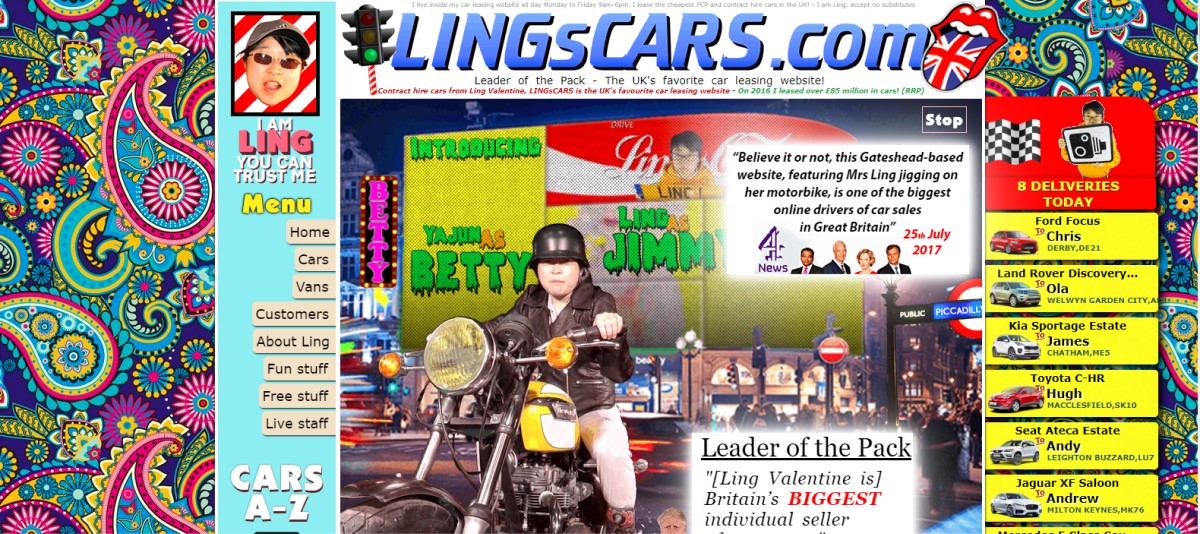
If you’re not a professional one who has a very good aesthetic, sometimes choosing colors can be hard to get your head around. Finding the perfect colors that work together as a cohesive palette is hard enough, then there’s the challenge of how to actually use them in graphics or around your website, and using them well together. And even though the color palette is great overall, that doesn’t mean using all of the colors at once looks good, and some pairs of colors from your palette might not work well together either.
Some website template overusing color. All of the colors are putting together in their graphics, or pairing up only the brightest colors which results in hard-to-read and hard-on-the-eyes graphics. So, use your colors wisely, make sure the colors attract your potential customers. Example of Lingscars.com:

#4: Lack of White Space
White space is really important for a good website. So many Do-It-Yourself websites want to just fill in all of the white space with images, patterns, background images, etc. There’s a place on your website for all of these things, but they need to be added strategically. You don’t need to fill every little gap in your web. If you don’t have any whitespace left, you will overwhelm people, and it makes it hard to have a clear call to action or any structure to your site.
Don’t think of whitespace as a lack of elements or design, think of it as a crucial part of your design.

#5: Fonts and Alignment
One very common thing from Do-It-Your website designers is their use of outdated fonts. Fonts come and go in trends, like fashion, and if you’re following the trends, you need to be able to keep on top of the trends. You can easily see the same fonts used over and over and over again by Do-It-Yourself website designers because it was fashionable recently. But choosing something that was fashionable recently isn’t a good idea, because you’re likely going to be using the same fonts as everyone else. If you’re going with trends, make sure you can either find something ahead of the trends or, stay away from trends completely and go with something classic and timeless! You don’t want to have the same, outdated, once-trendy fonts as everyone else.

Another problem I see is the overuse of different typefaces throughout a website. If you want your design to look professional, you need to choose fonts and stick to them, use them throughout your whole website.2-3 fonts in maximum are recommended. A main heading font, and secondary heading font and a body font. If you’re using a display or script font, do not use this font within the body! Keep your body text something really simple and clear to read. There’s nothing worse than seeing paragraphs of text in a hard-to-read script font!
One way to really make your website look professional is to make sure things are lined up properly. if you work on creating a cohesive alignment throughout your website it will look much more put together and professional. Images, boxes or text, lines, etc. Make sure the margins around your website are the even, that there’s no weird/out of place gaps, that your text alignment flows nicely.
The Bottom Lines
In the end, DIY approach is bad when it comes to your business website. Customers are smarter these days and they know the different between a pre-made template and a custom-designed website. You may not see any traffic or visitors and if you do, it’s likely they will leave because the website has not built enough trust in the company.
Within such a crowded digital landscape, establishing a solid online presence with your business website is more than vital! Having a professional devotedly design your own site will, of course, incur your expenses – but, it’s well worth investing, especially concerning the long-term success.
You May Also Like:


