The Secret of Stunning Dental Websites: Major Dos and Don’ts
These days, the Internet is ubiquitous, and as a result, traditional marketing efforts have expanded into the digital realm. Building a solid online presence with a well-designed and properly functioning website is a “must” for every single business. And your dental service is not an exception.
If you’re like several dental practice owners, promoting your clinic’s brand often feels akin to stumbling across a minefield loaded with revenue-destroying mishaps and blunders. Or perhaps you get lost in a maze of budgetary figures, ever-changing online consumer behavior, and web design and development.
Don’t panic! There remain a few golden rules of thumb – by sticking to them, you can easily avoid expensive mistakes and reap the harvests of your stunning dental website. To this end, let’s go through some major dos and don’ts to consider as you create your own site.
#1 Do Plan Carefully Before You Build or Change Your Site
Before you spend one penny developing a website or revamping an existing one, determine what you want people to think of you when they get to your site – for example, whether it is about professionalism, enthusiasm or even both. After deciding which impression you want to leave on your site visitors, create a visual representation of it, selecting fonts, features, and colors that will make your site match your vision. Besides, crafting a unique value proposition is more than essential for the first long-lasting impression. If you struggle with seeking ideas and need some inspiration, have a look at other websites that project the same look and feel you want to project, or reach out to colleagues or professional designers for help. Your website needs to present a “look”, “feel”, an approach that is wholly consistent with all of your online and offline patient interactions.
#2 Do Have A Through Website
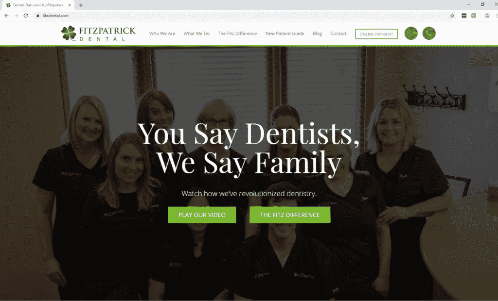
Understandably, individuals are flocking to dentists’ sites to find the information they’re looking for. This includes those who are already patients, but it’s particularly true for people who have never set foot in your office. With this in mind, your site should present all the essential information as well as answer all the important questions that you may assume people would call or ask, even if the information is clearly listed on Google. These questions possibly include:
- What is your dental clinic’s location, opening hours, and contact information?
- Who are you and what do your credentials include?
- Which specific services do you offer? Do you offer emergency services, cosmetic services, and/or surgery?
- Whether or not do you take insurance and, if so, what kind of insurance do you take?
Remember, if clients come clicking to your site looking for information and can’t find it, they’ll immediately go find it with your competitors.
#3 Do Organize Your Site for Ease of Use
Once you have lots of information about your practice on your site, it’s high time that you started to organize it properly.
The truth is that a bad website structure or hierarchy will cause you to lose website visitors and absolutely lose potential patients. If you thought people didn’t like going to the dentist before, just wait until you see how they react to a poorly designed dental website. In today’s internet-centric age, if your website’s content is not well organized and easily consumable, people are going to leave your site faster than if it was on fire. Recent findings of Crazy Egg – an online tool that specializes in tracking how website visitors interact with websites – revealed that on average, users spend less than 15 seconds on a webpage if it doesn’t immediately capture their interest. It’s crucial then, that you utilize proper website hierarchy to capture and retain your new patients online in these precious moments. To this end, an intuitive navigation bar or the visible drop-down menu to sort your content into the appropriate pages is, by all means, a great idea!
#4 Do Choose A Professional Yet Simple Design
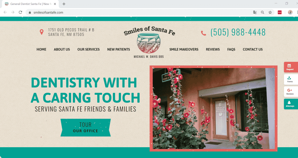
When one visitor lands on your dental website for the first time, it’s a little like an online dating: it only really matters how good it looks. Frankly, if your site looks like a mess, people won’t stick around to see what you are prepared to say – they will immediately navigate away, and then maybe head for your competitors’ site.
After all, you’re a healthcare provider, and patients may subconsciously trust you less to stay up to date on healthcare practices if you can’t even keep your site up to date. First, choose a design or have your designer create a clean site with lots of white space. Understandably, people never expect to get lost in dense blocks of text with no headlines or illustrative images. Plus, keep the clutter not only to a minimum, but off your site altogether, and use a subtle color palette and easy-to-read text that will look good on all screens. Neither should your visitors “hunt” for information nor they have to zoom in to see your text.

Moreover, if you plan your website well to match the practice you are building for the long-term, consider getting your website custom-designed and built to your vision. This helps you project the uniqueness of your practice and helps you avoid compromising on your practice’s digital footprint to fit a generic website template.
#5 Do Build Responsive Dental Website Design
Besides an eye-catching website, website responsiveness is a “must” for your site. If your website isn’t responsive or in particular, mobile-friendly, you’re behind the times. Why? Simply because in the year of 2017, mobile minutes spent online in the USA comprises of around 71% of the total digital minutes spent, which has a tendency to increase a lot more the following year. This figure speaks volume about the significance of having a responsive website design. For those who are not familiar with the term “responsive dental websites”, here it is in a nutshell: Responsive Web Design is the approach that suggests that design and development should respond to the user’s behavior and environment based on screen size, platform, and orientation.
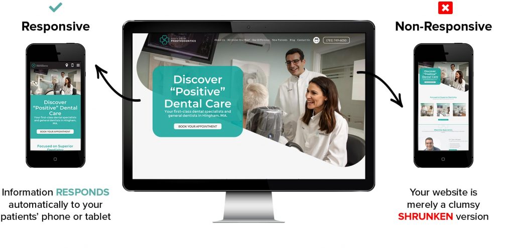
Furthermore, this is especially important with Google’s indexing change in March, where it was officially announced that Google will crawl and index websites from the perspective of a mobile user instead of a desktop user.
So, imagine what will happen if you have a bad mobile experience? Your rankings, as well as new bookings for your dental services, are going to drop like flies. As a result, you are leaving all your efforts and money on the table!
#6 Do Have An “About Us” Section
Speaking of marketing your dental website online, there tend to be more challenges than the average business might face. Why? Every dentist knows that patients aren’t exactly lining up every morning like children at a candy store. In fact, dentistry requires a slightly different approach to online marketing because there exist two things that are more important than anything else when it comes to marketing in the healthcare industry: Expertise & trust.
With this in mind, building a thorough “About Us” page on your site is a “must” to set yourself apart from other practices and form an excellent first impression by making it easy for potential patients to get to know you long before you walk through the door. Not only can you establish credibility and earn trust from your site visitors, but you can also nurture the relationship with your existing customer base.
So, what should you do to craft a winning “About Us” section?
- Clearly explain why you became a dentist
- Display a high-quality headshot – actually, people are less likely to trust those they can’t see
- Showcase your experience and education – remember to highlight what makes your practice different from the others
- Make sure your “above-the-fold” content is clear, concise and truly important
- Include at least one call to action on the page

#7 Do Feature Customer Testimonials
It goes without saying that client testimonials can set you apart in an instant, and it’s easily the fastest way to earn the trust of new patients. In fact, up to 88% of people trust online reviews as much as a friend’s recommendation. Modern customers rely on online reviews in shopping and choosing healthcare services. Any dental website worth its salt should absolutely have testimonials and social proof as a mandatory section of the page.
Then, how to do that? You can send out formal emails after every cleaning politely asking for reviews. Once you get one, especially the positive one, you should graciously ask if you can share these reviews publicly, and if your customers say “yes”, then it’s time to list them on the site.
Even if you only get one great review for every ten emails you send out, you’ll have a page full of inviting testimonials in no time which you can use to build trust.
When it comes to organizing reviews on your site, there are two wise options that are worth your attention. Whereas some practices will put the reviews in a sliding bar or just feature a few on their home page, others choose to place their best reviews on a testimonial page, which is highly visible in the main navigation bar. Either way, adding a few testimonials (around two or three) to the home page will capture your visitors’ interest quickly before they have a chance to sign you off.

#8 Do Invest Efforts into Building Unique & Up-To-Date Website Content
Not only does fresh content positively influence your site’s Google rankings, it does also deliver other significant benefits:
- Avoid losing their trust
The vital importance of trust to such a healthcare industry as dental services is no longer a matter of controversy. When a website visitor sees your webpage with dates from 2015 or specials that have long expired, they begin to wonder if you are even still in business or practicing in their area.
- Create a better experience for your patients
That the content of a website is not updated periodically or has no added value can result in an awful user experience. There is every likelihood that outdated content will lead to incorrect information, broken links, wrong contact information, or even doctors that are no longer practicing. Understandably, once a visitor experiences these things, they decide that you no longer care about your practice, and neither should they.
#9 Do Dazzle Your Patients with Multimedia
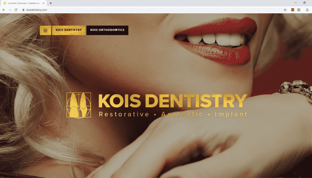
Besides original pieces of content, including some engaging images, videos, and illustrative graphics is more than essential to capture your customers’ interest and even sustain it for a long time Not only does this practice’s use of multimedia engage the visitors, but it also quickly evokes emotion. For instance, the smiling faces used in the hero area – usually an oversized banner image at the top of a website – convey to the visitors a positive sense about the brand before they even begin to learn more.
We have gone through some super powerful tips that you should follow for a stunning dental website, now let’s take a quick look at what you shouldn’t do wrong to hinder those efforts.
#10 Don’t Tolerate a Slow-Loading Site
This may not exactly qualify as a “dental website design tip,” however, it no doubt is crucial to the website design project. Huge brands know the importance of this as the case of Amazon:
- A 1-second website load delay on Amazon would cost $1.6 billion in sales
- An extra 0.5 seconds in search page generation time would drop traffic by 20% for Google
That being said, the data speaks for itself: Slow websites = fewer patients.
With this in mind, it’s more than vital that you have your site go though some speed test and carry out all the recommended improvements.
#11 Don’t Dump All Your Information on the Home Page
Having an information overload and jamming everything on your home page is actually one of the fastest ways to get people clicking away. It’s too difficult and frustrating to find what they’re looking for – it looks cluttered and it makes you look less professional.
Don’t lose credibility over such a silly mistake and make sure you’re adding visual elements like images and/or videos along with lots of white space to make sure that your site looks great.
#12 Don’t Leave Your Contact Information Weirdly Displayed
Is your contact information buried somewhere abstract and is difficult to find? Or when your site has a phone number clearly listed, is it optimized to be easily clickable on mobile? And do you build a contact form that asks for just too much information up front? You’ll rarely hear these answers directly from your audience, but rather, you see it indirectly through a small number of bookings for your dental services
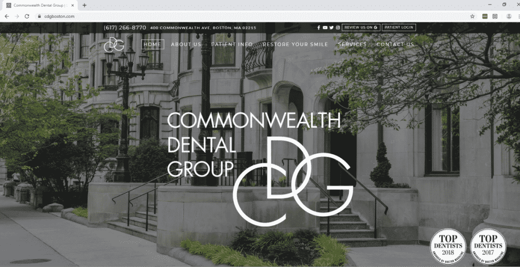
Should you want to get those appointments calling in, you need to make it as easy as possible for them to do so. Have your contact information prominently displayed in your site’s header, and make it clickable from mobile devices – but first and foremost, make sure these pieces of information are up to date!
#13 Don’t Neglect SEO
Search Engine Optimization (SEO) is a necessity in order to get users clicking to your site in the very first place. Some practices just haphazardly throw general dentistry keywords onto a few pages and hope it’ll work. But most of the time, it won’t!
For a better SEO ranking, let’s use a combination of long-tail and short-tail keywords that your specific audience is looking for, such as “Denver dentist” or “Colorado tooth whitening”. Perform in-depth keyword research for your specific area, and optimize most heavily for location-based searches. If you find it too challenging to handle by yourself, it’s alright to turn your attention to other SEO experts for a helping hand.
The Bottom Lines:
Far gone are the days when having a website was simply a bonus for dental practices. It’s now a requirement not only to have a site, but to design a stunning one. Whereas there seem to be several tasks to handle, it is all worth it in the end. Keep these 13 fore-mentioned website design tricks as a “google map” for your efforts and just wait for the rewarding results!
In this Internet-centric world, a solid online presence with a well-designed website is the lifeblood of every single business. And your dental clinic is definitely not an exception.


