Retailers: Top 10 Websites with User Centric Design
Not only being known as “Brick and Mortar” companies but retailers nowadays also build their online business to an empire. One element that made these retailers successful and dominated in terms of sale is their websites with user centric design – especially their Homepage. The homepage is considered as the most important part of the online business because it is the first page that customers or just visitors will view. The more professional and attractive your websites are the more benefits that your business can get. Bricks-and-mortar” accounts for 90 percent of total sales, but Retailers’websites are the main and really effective tool to advertise and market your business.
Nowadays, people have changed their ways to search for businesses, products, services, etc. They are now more likely to search the internet for that information instead of the traditional way. When the click to your website, the information that businesses want to show up first will represent on the Homepage. Your websites are the digital showroom of the business, so having quality websites are really important.
“Design is not just what it looks like and feels like. Design is how it works.” – Steve Jobs. An arresting website is one that intrigues visitors to want to explore deeper into the whole categories of the website. Let’s cut to the chase, here are the 10 retailers which have brilliant social media presence all over the world.
#1. Academy Sports + Outdoors
Founded in 1938, Academy earned 4.9 billion in retail sales in 2018. It is a premier brand of sports, outdoor and lifestyle retailer – which is in the top of best leisure retailers 2019, evaluated by Kantar Retail. This company operates 259 sporting goods stores throughout Alabama, Florida, Indiana, etc, offer a variety of footwear, apparel and equipment for sports and outdoor activities.
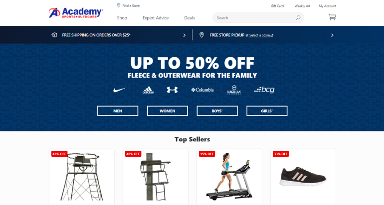
The color of Academy website is blue, which matches the brand’s color scheme and has consistency through the site. Academy website has a variety of items, divided into categories: men, women, boys, and girls. When accessing the online shopping market, customers can easily find information with thousands of products about sporting goods. The store is scientifically presented, combined with many convenient search tools, easy for consumers to find the desired product, cheap, accurate and in the shortest time.
#2. Chewy
Chewy is one of the best online pet food retailers in the world. From 2011 to 2018, Chewy has increased sales of dogs, cats, and other pet food and treats by 68% year over year. The customers mainly visit and buy products on their website. Chewy has enriched the lives of pets from locations across the United State, including Florida, Texas, etc.
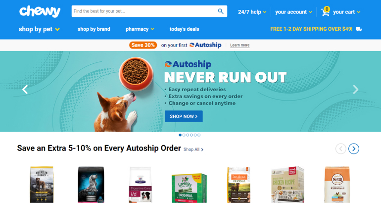
Through its website, the main products are clearly exhibited to the target customers which attracts them to watch more. This eCommerce retailer has a really qualified website that is well-organized and easy to navigate. With the promise on their website “We’re always here for our customers”, on the very first line of their homepage is 24/7 help through chat live with an expert.
#3. Bass Pro Shops
Bass Pro Shops was founded in 1971 by Johnny Morris in Missouri. Bass Pro Shops has over 161 stores, located in the United States as well as Canada. In 2018, retail sales of Bass Pro was $6.71 billion and sale per store was up to $41.7 million.
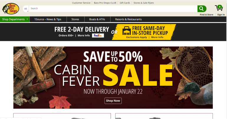
Concerning its online presence, all the important information is informed right on the homepage, especially these items are being sold off. Bass Pro Shops’s Homepage helps establish a visual identity that people can recognize and trust.
#4. Leslie’s Swimming Pool Supplies
Leslie’s Poolmart is the largest retailer of swimming pool supplies and related products globally. Leslie’s sells the full range of supplies for the pool maintenance, including chemicals, cleaning devices, filters, pumps, salt systems, safety covers, lighting, equipment, parts, recreational, and safety products.
Although Leslie was established after other companies in this list, it has also affirmed its firm position. The company operates over 900 stores in 35 states throughout the U.S. with over 2,400 employees. During its peak season, Leslie’s employs hundreds of seasonal employees bringing its workforce above 3,000.
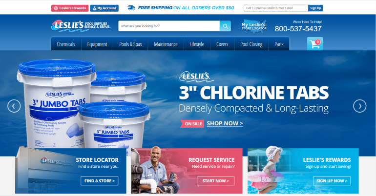
Leslie’s website is one of the websites which has show visitors what they’re looking for, show them where to start by the pop-up. Besides, easy-to-use web interface, and fast order processing function, smart product filters are also an advantage of Leslie’s. In addition, this website also provides consumers space for customers to request their services with the best price and quality.
#5. Tiffany & Co.
Tiffany & Co. is an American luxury jewelry and specialty retailer headquartered in New York City. It sells jewelry, sterling silver, china, crystal, stationery, fragrances, water bottles, watches, personal accessories, and leather goods. Since its inception, the brand has always been the first choice of big stars and is often given gifts to the first lady by books of presidents and jewelry.
One of the top power players in jewelry and accessories, this retail sales in 2018 earned $1.79 billion, included online sales related to respective retailers by Kantar Retail.
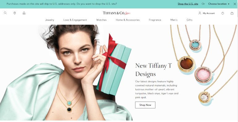
Tiffany &Co has positioned itself in the luxury jewelry market by the investment of consolidating the brand’s image, particularly its website. Simple but luxurious – the products with elegant visual is being put on the first page of the brand’s website. The “Tiffany Blue” color of all the logos, paper cards, gift boxes, bags and banners on the website makes the company stand out for its youthfulness and elegance. Blue is one of the colors that can create the most emotional connection.
#6. Under Amour
Under Armour is an American company that manufactures sports, footwear and casual apparel. With over 15,800 employees, this retailer has more than 150 stores are located in major cities all over the world. Under Amour has begun to sell its products on the website where it offers more than 330 styles of footwear and clothing in training and running categories.
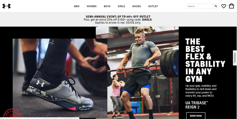
One of the best retailers, Under Amour is stealing market share from Adidas, Nike, etc. Concerning its website, the specific logo – the business branding and identity of Under Amour- is visible at the top of the website. Under Amour does realize the importance of the online presence of a company, right at the Homepage – this company demonstrates the sporting spirit in its visual. The visuals of people using Under Amour products engage with their products and logo create the connection between visitors and this brand.
#7. Claire’s
Formerly known as Claire’s Accessories, this retailer is famous for its accessories, jewelry, and toys for girls, tweens, and teens. Founded in 1961 – 59 years ago, now Claire’s has thousands of store in more than 40 countries around the world. Their stores are in 96% of all U.S. shopping malls, and Claire’s has done more ear piercings than any other retailer, over 90 million in more than 25 years
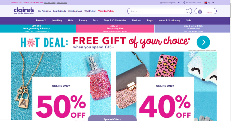
With a strong and professional investment in the interface and features for e-commerce websites, target customers will get easy to find products they want to buy with all information. One difference aspect of Claire’s website homepage design is the colors. With lots of colors, the percent sale is also highlighting – they can help guild the visitors’eyes, making for a more pleasant experience, and will influence people’s thoughts about this brand.
#8. AT&T Wireless
but quickly gained the advantage and influence due to identifying good customers segments, focusing on online shop owners and young customers. The homepage of AT&T Wireless provides intuitive navigation and a sense of how the website flows through the categories.
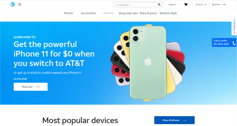
With its inherent youthfulness, modernity, and creativity, AT&T has always affirmed its unique position not only in technology but also in the e-commerce market in the retailers market.
#9. The Home Decor Superstore – At home
At Home is an American retail chain specializing in home decor products based in Texas. The specialty retailer’s stores each carry over 50,000 unique items across broad product categories including furniture, garden, home textiles, housewares, patio, rugs, seasonal decor, tabletop decor, and wall decor.
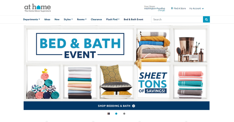
At Home stores have a wide range of items; however, the company devotes a large portion of its space to seasonal merchandise. On the landing page, At home enhance their brand’s image by all their specific products.
Simple but smart, visitors and easy to find products in any style they need. The gap provided on the landing page makes their website different from those above and helps to grab visitor’s attention.
#10. Burlington
Burlington, is an American national off-price department store retailer, and a division of Burlington Coat Factory Warehouse Corporation with 631 stores in 45 states under the names Burlington Coat Factory, Cohoes Fashions, Baby Depot, MJM Designer Shoes, and Burlington Shoes, with its corporate headquarters located in Burlington Township, New Jersey.
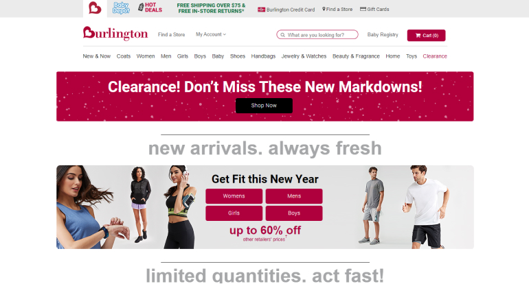
Burlington eCommerce website has its simple message clearly on their Homepage to attract visitors. Categories organized in a way that makes it easy for visitors to understand what Burlington offers. Burlington asserted its firm position with strong investment and a strong market in technology products with preferential prices and excellent customer care policy.
Besides, giving super terrible promotions such as: constantly launching flash sale, limited quantities, new arrivals, … Thanks to that, in 2019, Burlington still maintains the position at the top of retailers.
The Bottom Lines
Consumer behavior has changed to adapt to the digital age. In order to attract customers in this potential business market, besides investing in effective marketing campaigns, E-commerce exchanges must also simultaneously upgrade and update the features. New to the website, build a complete utility system to bring the best experience to customers. Because marketing will bring users, but to retain users to stay on the website longer, it is thanks to the utility as well as the ability to attract users’ visual.
The 10 in best retailers on this list show a significant impact on them throughout their websites. Especially, a homepage’s impact on an eCommerce company is far greater than simple measures of e-commerce revenues: The homepage is your company’s face to the world. All retailers launched its website as a tool to confirm their position in the lucrative business, let’s build yours.
You May Also Like:
Brick and Mortar vs Online: Opportunities and Challenges for Businesses

